

Without narrative and context, cold hard facts can lose out to assumptions
What makes a good recipe?
To begin, it needs beautiful pictures and a mouthwatering description to make the reader excited to create the dish at home. It needs a list of high-quality yet accessible ingredients that, when combined, add up to a result that’s greater than the sum of its parts. It needs instructions that are clear and easy to understand: “add the flour and stir vigorously for one minute, or until the mixture is smooth” instead of “add flour.”
But what a good recipe needs more than anything is narrative. I’m not talking here about paragraphs and paragraphs of the recipe creator’s life story or how they developed this recipe after an emotional vacation back to their ancestors’ hometown in the old country. Instead, I’m talking about a list of instructions laid out in a logical order that makes it easy for the reader to reach the desired result.
This narrative structure — ensuring that instructions are laid out logically with a beginning, middle and end — provides the context necessary for a great result.
In today’s business environment, we can compare the use of data in decision-making to a recipe. When data and analytics are laid out in a narrative and properly tied to goals and outcomes, the result is a tangible business benefit comparable to the best carbonara or cassoulet. But if data is simply presented to business leaders without a story or context — the equivalent of a list of ingredients and no instructions — the effort is destined to fail.
Telling stories with data
What makes a good data story? These three factors are crucial:
Simple: Just as a recipe developer will likely have hundreds of hours of experience in the kitchen, as well as intimate knowledge of the science of cooking, a data analytics professional will have a much more sophisticated understanding of raw data and what it means for the business. The job of the analyst is to distill the vast amount of possible analysis of the data into a concise set of insights that are needed to execute business outcomes. At the end of the day, is it possible to fit our entire analysis into one slide starting with identifying areas of opportunity? It is important to ask what the data is telling us, what is going to be done and how is the business going to benefit—to justify the cost. The best-adopted analytics solutions are those that can be distilled down to a simple set of recommendations ready to be acted upon by the business
Actionable: It’s not enough for data to paint a picture of what’s happening now in an organization. Useful data insights must be predictive and prescriptive, providing business leaders with clear instructions on what step they should take next. A great data visualization exposes problems buried in mass amounts of digital information. Take, for example, one set of raw data that could indicate the total sales revenue for the Commercial and Premium channels. Another set of raw data could show the revenue from various promotions that were running. What turns this raw data into actionable insights in the same way a visual guide communicates the best decision? Taking executives through the story.
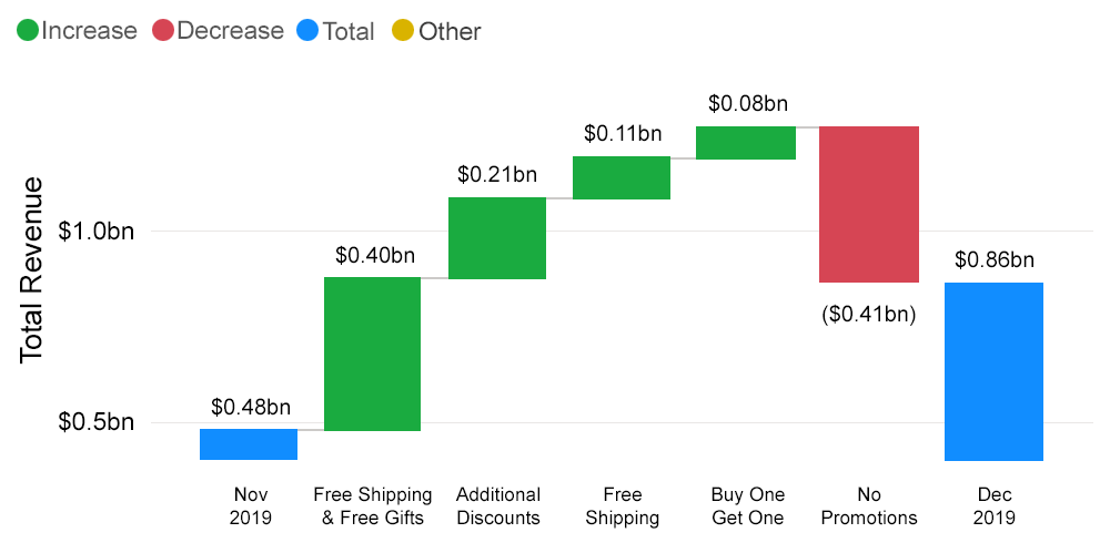
For example, one major retailer during the 2019 holiday season saw an 81% increase in sales in its Premium channel as a direct result of its ‘Free Shipping & Free Gifts’ promotion. The insight is clear, and the next step is obvious: drive more promotions on ‘Free Shipping & Free Gifts’ to boost overall purchases.
Visually Compelling: Everyone processes information differently. While some may be at home with numbers, others may need things explained to them verbally, while still others have an easier time understanding charts or images. It’s not enough to organize data in an easy-to-understand story—that story should then be communicated through as many methods as possible, including visual formats. Graphs, diagrams, pictures, and videos can all help to both attract attention and reinforce key insights and messages. Imagine if we can showcase the split of revenue from channel to category to subcategory to brand in a single decision board. During the latest conversations with the brand managers of the same retailer, we observed that there was a lot of social media buzz around the brand Barley. When we drilled down by channel and category, we were able to see that Barley dominated sales of the products that fell in the nighttime skincare category. This visual flow helps decision-makers understand the root cause of their sales lifts.

Similarly for a leading US media retailer, the ability to have a simplified reporting structure with the focus on “What happened” and “Why it happened” was a strong business need. But the lack of a unified view due to the siloed nature of the business verticals and independent operating models was causing a major roadblock for decision making. Multiple reports were maintained, and it was difficult to garner insights from the disparate data sets. When we created a simplified dashboard that was visually compelling by building a common data model with harmonized data, the business was able to overcome the roadblock.


Towards the same vision and mission
Data Analysts need to focus more on storytelling than just showing the depth of analysis to help businesses make better decisions. Understanding the business story and getting actionable insights by following the best practices on top of the abundance of data on hand will be an inevitable priority. Turning the ever-growing data into something meaningful and useful in terms of tangible business results can help everyone move in lockstep toward the organization’s vision and mission.
Appendix