

When it comes to data collection in today’s digital era, the sheer volume of available data is staggering. Can the average business do anything with this volume of data? To be successful, you have to pay attention to the available data and see how you can extract the most out of it. But how? Data is only useful if you have a way of managing it and turning it into insightful information.
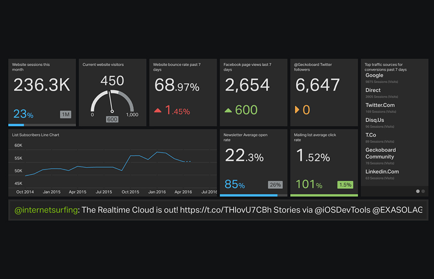
Digital marketing dashboards are a great way of consolidating data and providing in-depth business analysis within an organization. They are designed exclusively to capture insights and monitor important performance indicators that drive action, which will then go on to have a deeper business impact.

Guidelines for an effective digital dashboard:
• The content of the dashboard must be relevant and aligned to the business goal.
• It should be actionable – a dashboard without actionable insights is merely a report.
• It should be pertinent to the target audience, yet easily understandable to anyone in the organization.
• The displayed data should be automatically updated without any interference from the user. The most effective dashboards have data updated at regular intervals so that they showcase only the recent data.
• It should provide easy visibility of KPIs and must be simple enough to interpret how it aligns with departmental and strategic goals.
• It should pilot the decision making process by providing explicit and insightful performance parameters, thereby eliminating noise.
Shown below are a few examples of dashboards designed at LatentView:
EXAMPLE 1: The progression of payment attempts through various stages of a financial payment checkout process needed to be visualized in order to monitor the performance of the flow. Rather than bombarding the user with an array of numbers and metrics, we decided to visually reconstruct the logical paths a user can take. When the required numbers were fitted inside the blocks and the objects were aligned to be aesthetically pleasing, the result was a simple, yet intuitive dashboard which also showed the story behind the numbers. It provided various options for weighing parameters to the metrics in the form of filters. The report was built to allow comparison of performance between two different time periods.

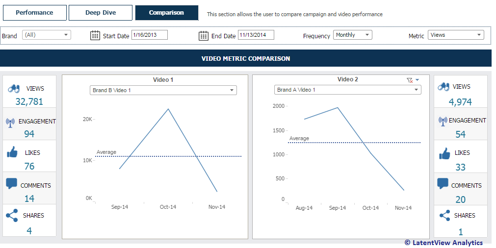
>EXAMPLE 2: Shown below is yet another dashboard we created with simple and insightful charts that provided the performance snapshot of Brand A vs Brand B during their promotion videos. Instead of looking at raw numbers, we decided to come up with a one page summary which was rich in content and provided an aesthetic view of the comparison in the most fitting way.
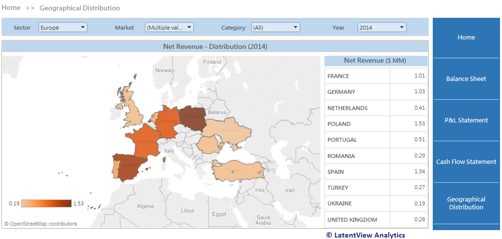
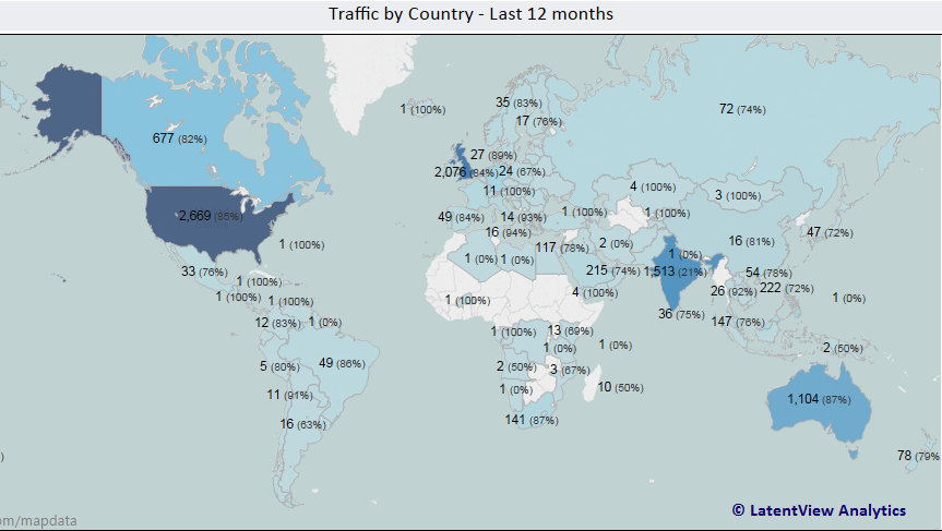
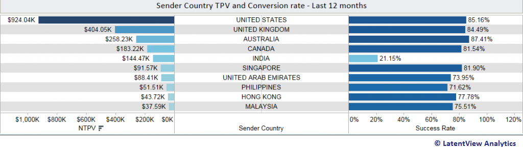
EXAMPLE 3: Another sample dashboard is shown below and this contains a variety of insightful charts. In order to get a snapshot of the merchant’s behavior in the recent months, we needed to look at their basic transaction and conversion numbers. Instead of just looking at raw numbers to profile a merchant, we decided to come up with a Geo Map, which was visually more appealing.
Dashboards, when clear and concise, will aid in analytical thinking and help businesses take more insightful and informed decisions. To conclude, a good dashboard is an invaluable business aid, only if the emphasis is placed on the correct aspects. Along with aesthetics, it is also important to make sure that the visualization is not valued ahead of accessibility of relevant and real-time data. That’s when data can be used to drive innovation & business results.
In the end, it is all about what you should measure, where you can find the data, how you should analyze, why you should track performance and when you should incorporate the transformations.
With inputs from Patrick Kumar, Anoosha Pattabiraman, Shahidhya Ramachandran, Raguram Anbazhagan